The initial steps of interface
Now we would like to tell you some words about the interface of The 3rd Day of Creation.
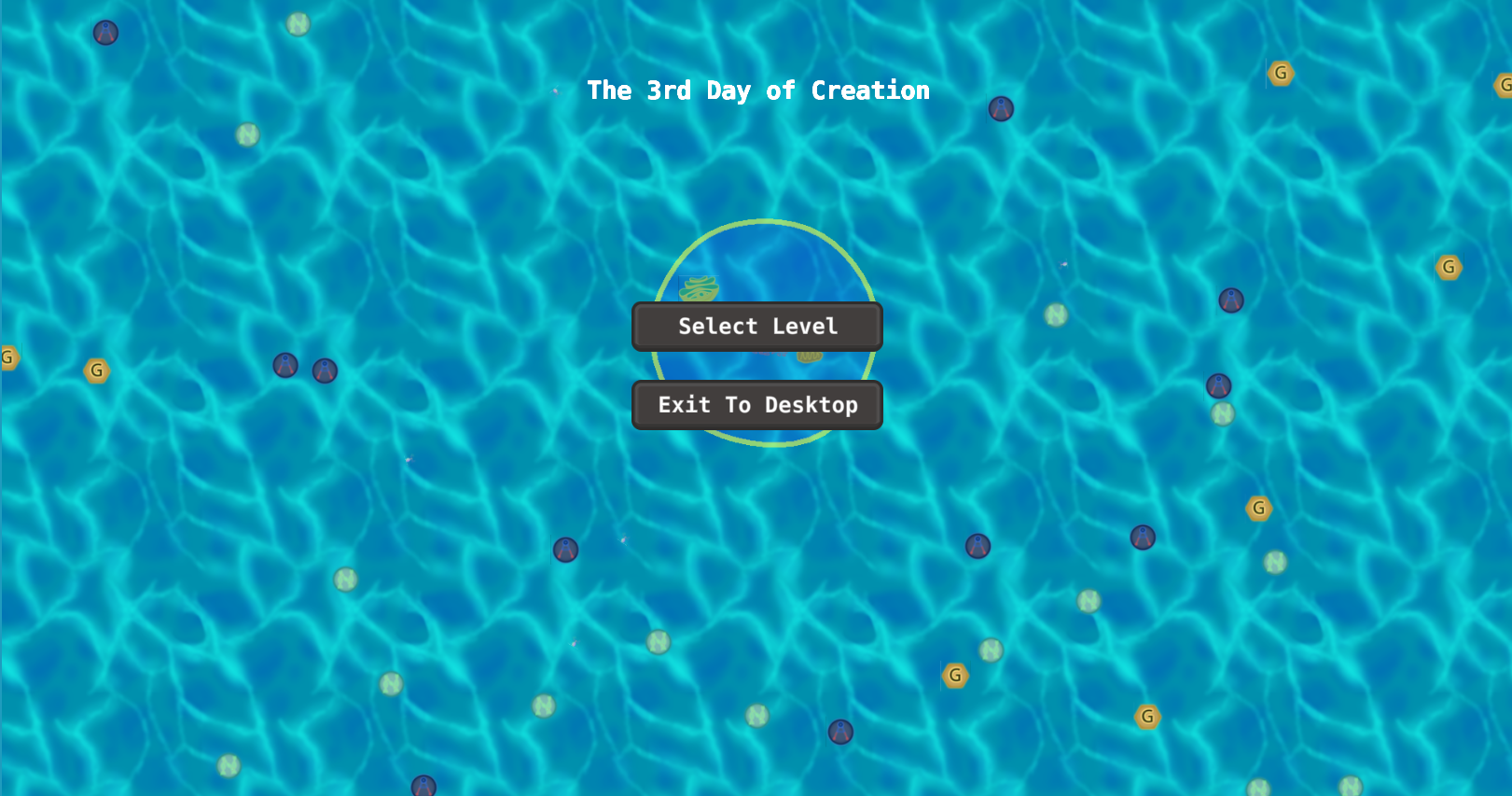
The start menu

You see this menu as soon as open the game. You can select level or exit.
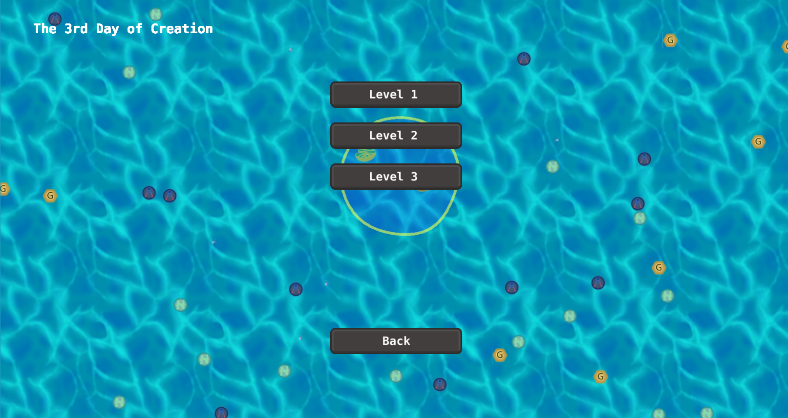
The menu of selecting levels

Well, the name of this menu tells you all about this window. There is nothing to say more.
The game process

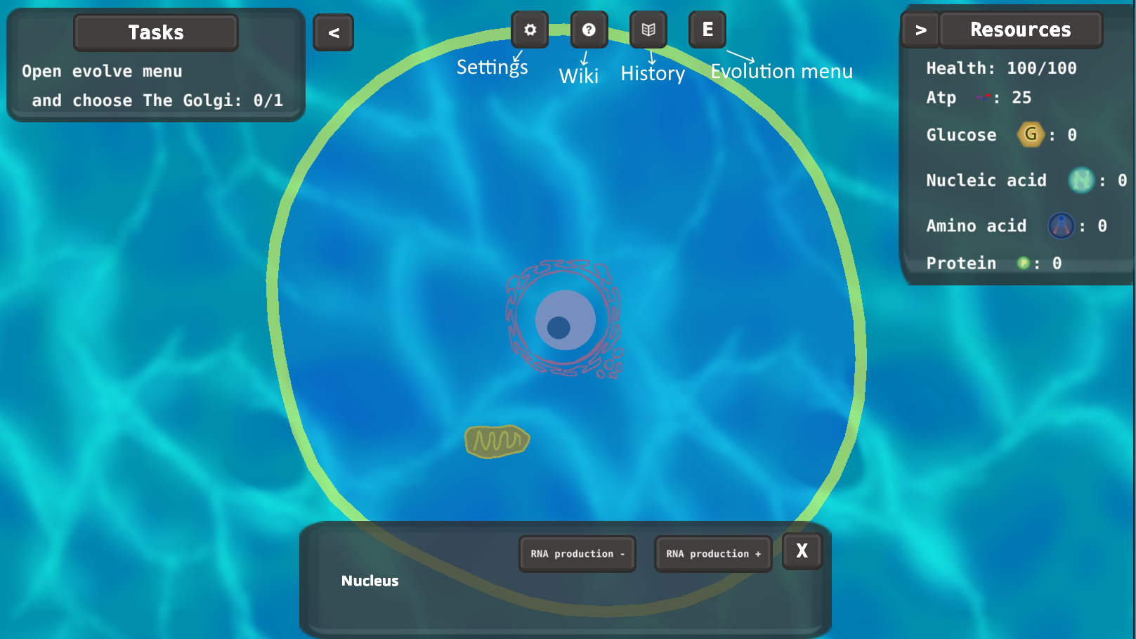
Finally, we should talk about the most important window in the game - the game process window! In the picture above you see how your screen usually looks during the game process.
In the right corner you see the information about the number of resources you have and about your health. In the left corner there are the tasks, you should do to complete the level. Both these menus you can hide and open with the help of the buttons with < and > symbols near the menus.
Also, in the top of the screen you see four buttons: settings, wiki, history, and evolution menu. In the wiki you can learn a lot about the cell in our game and in reality. In the history there are all the messages that you received during the game.
Besides, in the bottom of the screen there is an organoid menu. You will see it if you click on some organell. In the menu you see its name and buttons with some actions.
Get The 3rd Day of Creation
The 3rd Day of Creation
The beginning of life, adventure of a Cell.
| Status | In development |
| Author | StarFolk |
| Genre | Simulation, Action, Adventure, Survival |
| Tags | Arcade, biology, Singleplayer |
More posts
- DownloadsFeb 14, 2022
- New movementFeb 10, 2022
- New design of the interfaceFeb 05, 2022
- New defense mechanismFeb 04, 2022
- New Release! Version 0.1Feb 03, 2022
- New Art StyleJan 31, 2022
- Tasks and evolutions managementJan 26, 2022
- In the beginning was a wordJan 17, 2022
Leave a comment
Log in with itch.io to leave a comment.